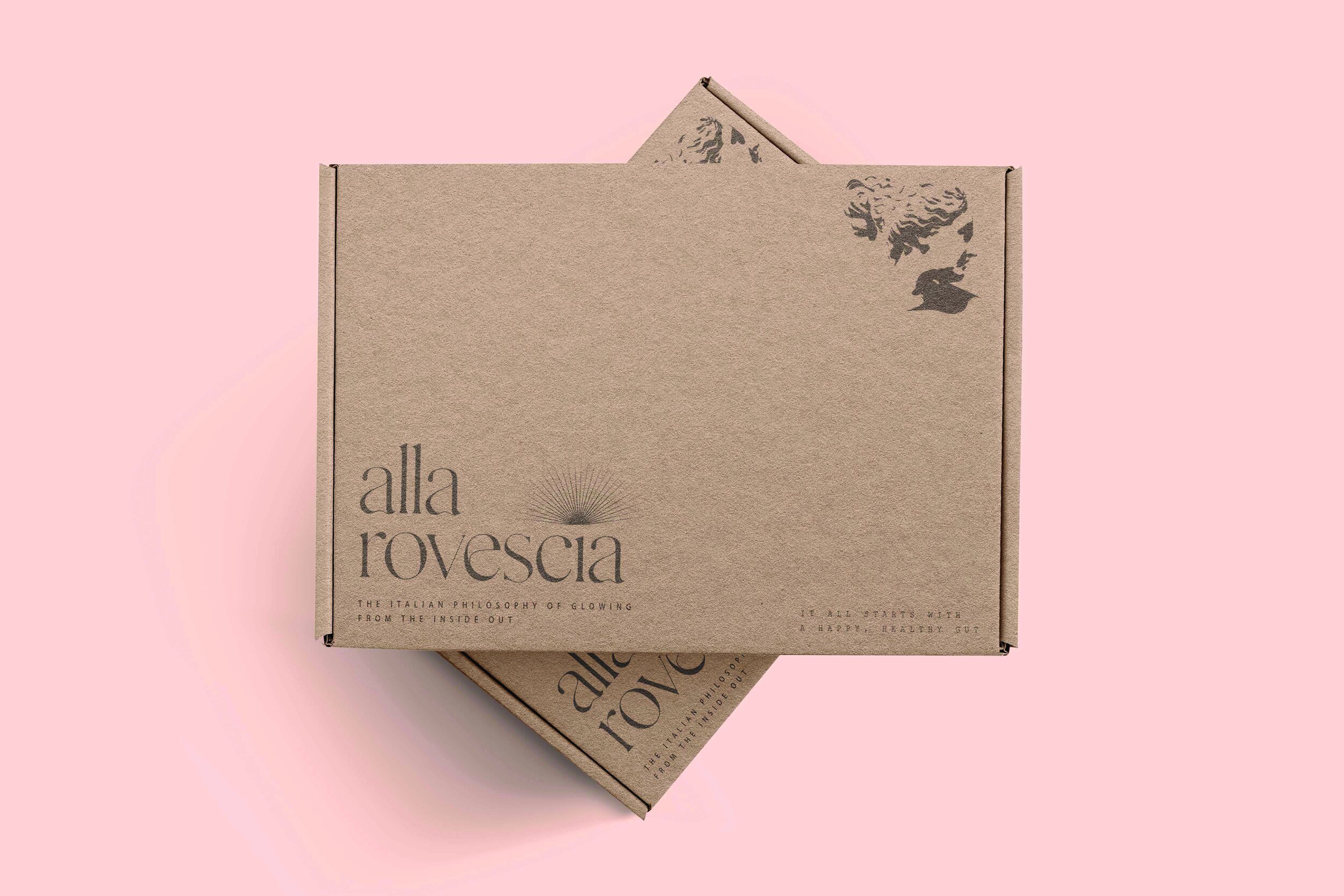
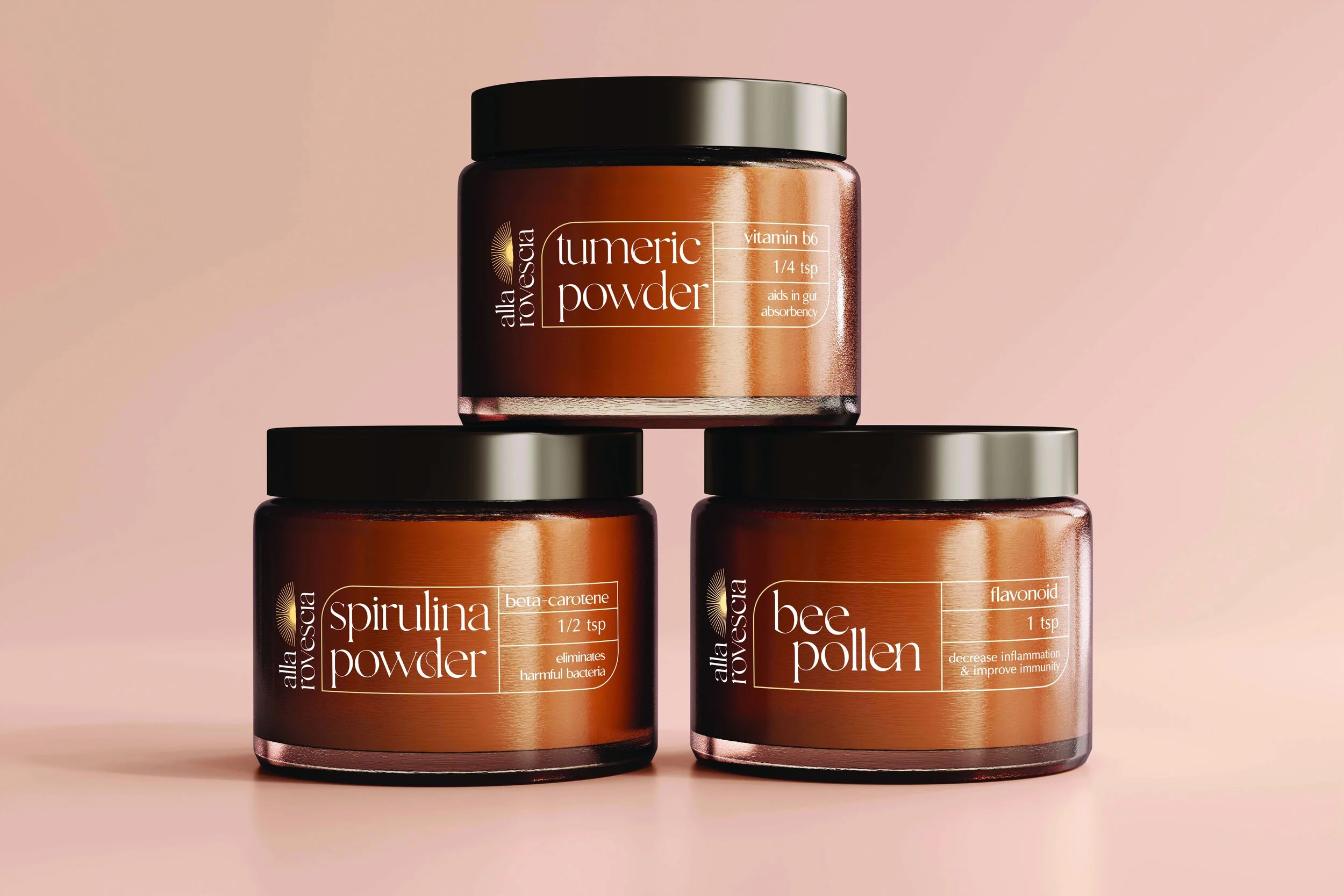
BRANDING / PACKAGE DESIGN / LABEL DESIGN
I went with a simple and elegant aesthetic for the logo and overall package design because it is more recognizable at a glance. I chose the typeface Gallient for its authentic handcrafted style, being clean, modern, and minimalistic, similar to the brand itself. The sunburst is a decorative motif that has roots in the halos surrounding figures in Italian medieval art.
The sub logo for Alla Rovescia is inspired from an Italian Revivalism bust. The bust is meant for instant recognition for the Italian brand. I added a hoop earring to give the sub logo a bit of a contemporary flare.